
Flexbox vs CSS Grid: An Opinionated Comparison
CSS Grid and Flexbox are two popular systems designed to accomplish grid-based layouts on the web. This article is meant to provide you with a better understanding of CSS Grid and Flexbox, as well as when, why, and where you should be using them in your projects.
What are CSS Grid and Flexbox?
CSS Grid Layout is a two-dimensional system, handling both rows and columns, whereas Flexible Box Layout Module, or Flexbox, is a layout model for displaying items in a single dimension, as a row or column. It’s important to note that CSS Grid and Flexbox don’t have to be used independently of one another, and can be used in conjunction.
Understanding One-Dimensional and Two-Dimensional Layouts
At first, CSS Grid didn’t make a bit of sense to me. I had been using Bootstrap and/or Foundation for all of my layouts, both of which primarily use Flexbox for layout architecture. I didn’t think there was a legitimate reason to stop using Flexbox and to start using CSS Grid, until I dove head first into implementing CSS Grid on a project. l couldn’t grasp the difference between one-dimensional and two-dimensional systems, which is imperative when learning about CSS Grid. If there is one item you take away from this article this is it.
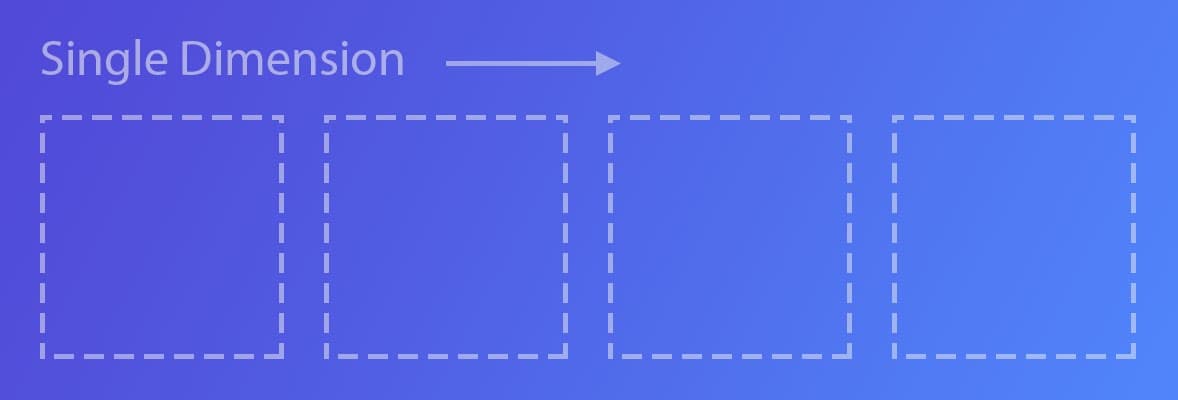
One-Dimensional
A one-dimensional layout processes layouts in one dimension at a time, such as a row or column.
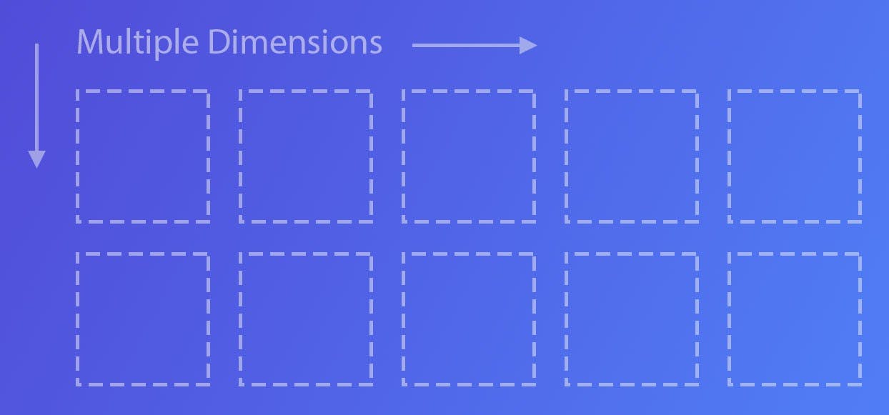
Multi-Dimensional
A multi-dimensional layout processes layouts in 2 dimensions, or columns and rows together.
Features
CSS Grid and Flexbox have both similarities and differences. Below I have included some of the unique features that these two methodologies have as well as some similar utilities.
Similar Utilities
- Alignment and Justification – Alignment and justification were one of the most powerful utilities to be introduced with Flexbox. It allows developers to stretch content, match heights, vertically and/or horizontally center content, and much more. We no longer have to use hacks, or any Javascript for layouts, which is a huge win. CSS Grid also has the same utilities. Having the power to vertically and horizontally lay out content with both CSS Grid and Flexbox is huge for front-end web development.
- Ordering – Ordering is a utility that allows you the power to move content around as you see fit, or order it in a particular way. Two of the most common needs for this is for accessibility and responsiveness. Normally you want the content to flow in a certain way, but the layout doesn’t always match. Having the power to move around content as you see fit is a necessity.
- Gap Utilities – In my opinion, one of the most powerful features of CSS Grid has always been its grid gap utility. Flexbox hasn’t had a great way to add spacing between blocks until recently. The flex gap utility is meant to have the same kind of implementation as the grid gap utility, but it’s just for Flexbox. The big difference between the implementations is the browser support. It is great to see strides in the right direction though.
CSS Grid
- Fractional Units – A very powerful feature that Flexbox doesn’t have is fractional units. This allows you to not just rely on percentages for widths and heights of columns and rows. Fractional units take up whatever space is available, instead of relying on a calculation of a percentage that isn’t as accurate, and let’s face it, can be more confusing.
- Grid Template Areas – Grid template areas are an awesome feature of CSS Grid. This allows you to name your columns and rows. The template area names don’t show unless inspecting a page, but it allows you to find things easily. I haven’t used this much, but it has been integral in finding layout bugs in the past.
- Gap Utilities – The gap utilities are one of the major reasons I love using CSS Grid. Gone are the days of using hacks to get even spacing between columns and/or rows in a layout. Please note that these gap utilities are not padding or margin. The gap utilities are, and should be kept separate.
Flexbox
When CSS Grid was introduced, all of the utilities that Flexbox had were shared with it. For that reason, Flexbox does not have any significant unique utilities.
Properly using CSS Grid and Flexbox
Like much of development, there isn’t an exact way you should use CSS Grid and Flexbox, but there are suggestions on how it can be used more effectively. CSS Grid is primarily a layout-first system, while Flexbox is a content-first system. This may be a bit confusing at first, but essentially, it means that the structure of the page ( header, sidebar, content, footer, etc. ) should be CSS Grid, and the contents within that should be Flexbox. Of course, there are always certain use cases where this could change, but this is the most straightforward approach to using CSS Grid and Flexbox.
Shouldn’t I Just Use a Framework?
While we could use a framework, such as Bootstrap or Foundation to achieve simple layouts, it isn’t always necessary. Frameworks are a bit of overkill in my opinion. The biggest benefit frameworks have is they have normally been tested thoroughly, and you can count on them to have support for legacy browsers. They are quick, efficient, and relatively easy to work with. In my opinion, frameworks are becoming more and more obsolete. CSS Grid was built to have an actual layout system for the web. Coupled with Flexbox, layouts are easily obtained. You have much more flexibility, you are not constrained to any naming conventions, and you don’t have to worry about the bulkiness of the framework. At Storyware we use Tailwind CSS which gives you all of the features of a framework, but without the bulkiness of a framework.
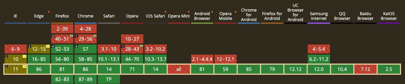
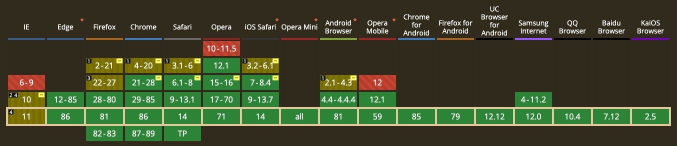
Browser Support
CSS Grid and Flexbox are well supported in browsers today. Developers should feel comfortable using them without worrying about part of your layout breaking. The big deciding factor is if you need to support legacy browsers. Now that Internet Explorer 11 is considered a legacy browser and is no longer supported by Microsoft, it is hard to find a legitimate reason to not use CSS Grid. Even if you use CSS Grid and have to support Internet Explorer 11, there are ways to implement fallbacks using Flexbox with feature queries.
What should I use? CSS Grid or Flexbox
In web development amongst other things in life, there isn’t a one size fits all approach to building layouts. It all depends on the project’s requirements, what you are comfortable using, or what your company requires you to use. As fewer Storyware clients require Internet Explorer 11 support, we are starting to incorporate more CSS Grid into our projects. As you can see, there isn’t a correct answer to this question, but I hope this has provided you with some information that you can use going forward.
For more information and sample usage of CSS Grid, please check out this article.
For more information and sample usage of Flexbox, please check out this article.