Understanding Container Queries and Media Queries
In the ever-evolving landscape of web development, creating websites that adapt seamlessly across various devices and screen sizes is key. Two important tools in achieving this are container queries and media queries. While they share a common goal of making designs responsive, they differ in their approach and capabilities. In this post, we’ll dive into the nuances of container queries and media queries, exploring their differences, benefits, and best practices.
What are Container Queries

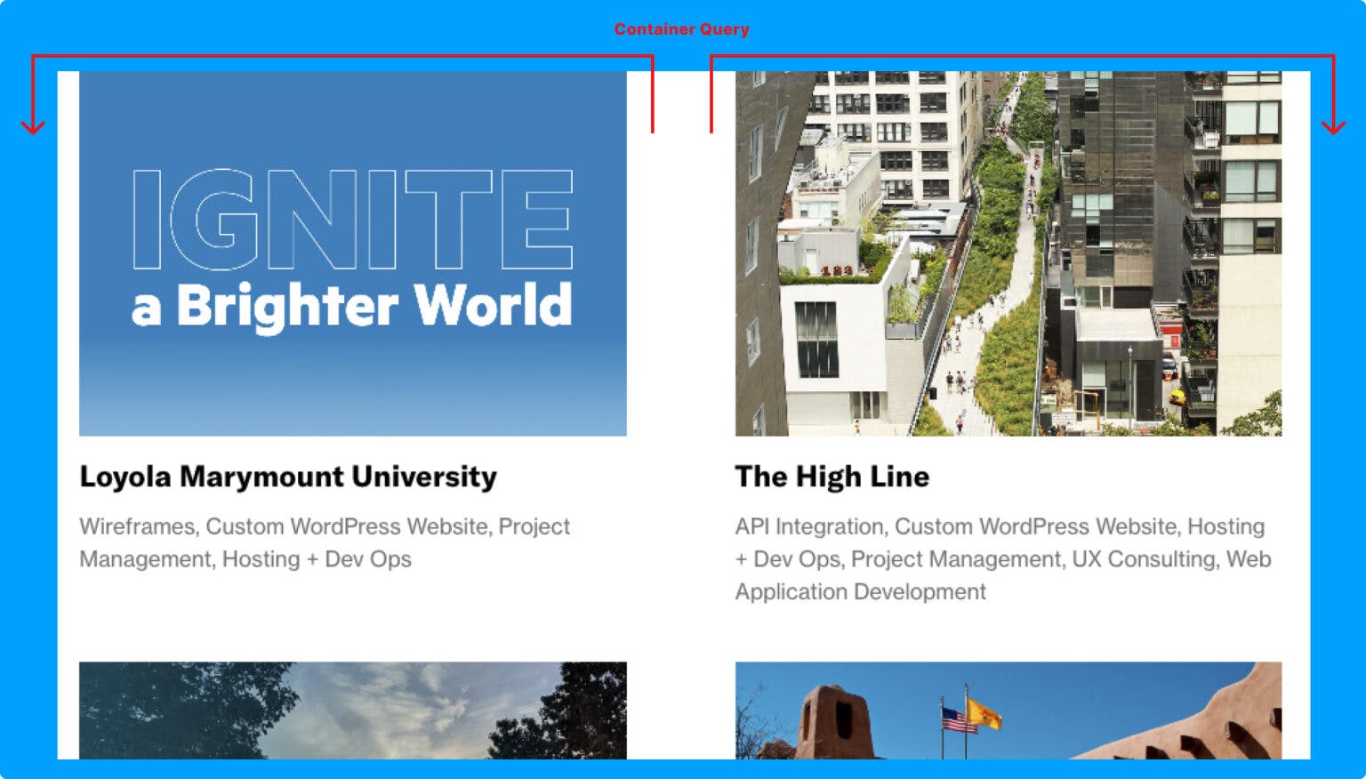
Container queries are a relatively new addition to web development, designed to address a longstanding limitation of media queries. Instead of targeting the viewport as media queries do, container queries allow styles to be applied based on the dimensions of a specific container element.
This distinction is crucial. With container queries, elements can respond directly to changes in their parent container’s size, enabling more granular control over layout and design. This means elements can adjust their appearance based on their context, rather than solely relying on the viewport size.
Benefits of Container Queries
- Contextual Responsiveness: Container queries enable elements to adapt based on their container’s dimensions, providing a more contextually relevant response compared to viewport-based media queries.
- Modular Design: By encapsulating styles within individual components or containers, container queries promote modular design practices, making it easier to maintain and scale complex layouts.
- Flexibility: Container queries offer greater flexibility in handling responsive design challenges, allowing for dynamic adjustments at a more localized level within the DOM.
- Reduced Complexity: With container queries, developers can write CSS rules that are inherently more intuitive and maintainable, as they directly reflect the desired behavior within specific components.
What are Media Queries

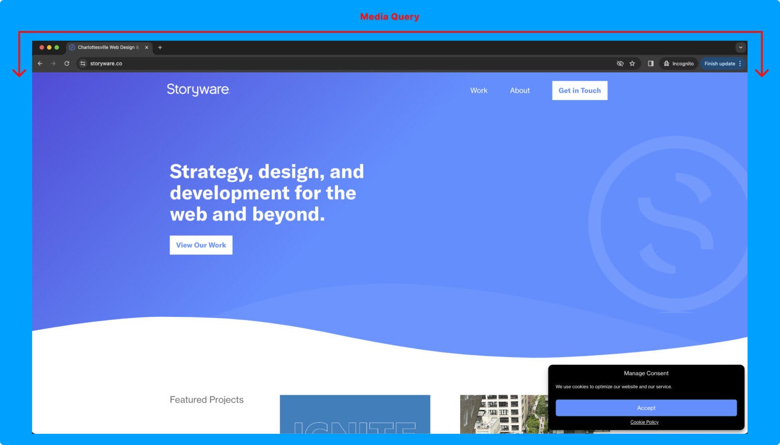
Media queries have been a staple of responsive web design for years. They allow developers to apply styles based on characteristics of the viewport, such as its width, height, or device orientation. Media queries have played a vital role in making websites adaptive to various devices, but they do have limitations.
Benefits of Media Queries
- Viewport Adaptation: Media queries excel at adapting layouts to different viewport sizes, making them essential for creating designs that work well across a wide range of devices.
- Device Compatibility: Media queries are supported by virtually all modern browsers and are widely used in frameworks and libraries, ensuring broad compatibility across different devices and platforms.
- Global Scope: Media queries operate at the viewport level, allowing developers to define styles that apply globally based on the overall screen dimensions.
Choosing the Right Tool for the Job
Both container queries and media queries have their strengths and use cases. When deciding which approach to employ, consider the specific requirements of your project:
- Use Container Queries When: You need elements to adapt based on their container’s size, want to encapsulate styles within components, or require a more modular and maintainable approach to responsive design.
- Use Media Queries When: You need to adapt layouts based on viewport characteristics, such as screen size or device orientation, or when targeting a broad range of devices with consistent styling adjustments.
Best Practices
- Progressive Enhancement: Start with a mobile-first approach, using media queries to create a responsive baseline layout. Then, leverage container queries to refine the design and enhance adaptability within specific components.
- Testing and Fallbacks: Test your designs across various devices and browsers to ensure compatibility. Since container queries are still evolving and not universally supported, provide fallbacks or alternative styling for browsers that don’t support them.
- Semantic HTML: Structure your HTML markup in a semantically meaningful way, making it easier to implement responsive designs using both container queries and media queries.
Conclusion
Container queries and media queries are invaluable tools for creating responsive web designs. While media queries excel at viewport-based adaptation, container queries offer a more contextually aware approach, enabling elements to respond dynamically to their container’s dimensions. By understanding the differences and benefits of each approach, developers can employ them judiciously to create highly adaptive and user-friendly websites in today’s multi-device landscape.